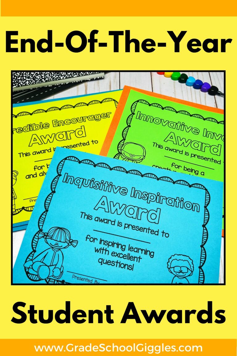
Mastering Anchor Charts: Making Magnificent Anchor Charts
Pinterest can be a great source of inspiration when you’re making anchor charts. However, it’s easy to get overwhelmed by the artistic cuteness of some pin-worthy anchor charts.
Keep in mind that the purpose of an anchor chart is to provide learners with a reference tool or anchor for their learning. It’s not about being an artist or making it perfect.
Anchor charts are about the learners. They need to be useful, and students are more likely to use them when they help create them.
Making Anchor Charts
I want my anchor charts to be made with my students, not just displayed for them. I still want them to be cute, though, because they will be used over and over again.
I’m not a quick writer, and my handwriting is not the best. So, I find it super helpful to plan out my anchor charts ahead of time.
Planning Your Anchor Charts
Start by thinking of your anchor chart in thirds.
- Top: The top third is the title, goal, or essential question. You might also include a definition or standard in this section. The top section can be prepped entirely before class if you want to make it cute. This is the section where you can use fancy letters, add a banner, or add other decorative elements.
- Middle: The second third of my chart is the main content. This section includes the main points of what I want my students to learn from the lesson, so it needs to be very readable. I often have this section mapped out ahead of time, at least in my mind. Bullet points and lists are easier to read than long sentences or paragraphs. Simple graphics like boxes, lines, or arrows can be useful ways to separate information.
- Bottom: The third section is usually where I include examples or summarize the main point. I learn best with examples, and I think a lot of my students do, too. I usually don’t sketch this out ahead of time in too much detail because my students usually have a lot of input in this section. I often ask them to provide examples and add theirs to this section.
Tips For Making Anchor Charts Cute
Obviously, the content and legibility matter more than how cute your anchor charts are, but most elementary teachers still like making anchor charts cute. So, let’s talk about some easy ways to make your anchor charts cute.
- Use fun lettering for the headings & subheadings. You can project and trace fonts you like.
- Use colors. Write most of the text with black or blue markers, and use bright colors to highlight keywords or important points.
- Add pictures. Draw, trace, or print out pictures to add. Visual examples are super helpful for many learners.
- Use borders and boxes to separate sections and to add color without reducing the legibility.
Keep the sections tidy and leave plenty of white space. Simple graphics are perfect for highlighting key points and breaking up sections.
- Boxes
- Banners
- Flags
- Lines – Straight or wavy solid, dashed, or dotted
- Arrows
- Bullets
- Thought or speech bubbles
Ways To Make Anchor Charts Reusable
If I’m making an anchor chart that I want to reuse, I will often go ahead and put on the headers, graphic organizers, major bullet points, and any art. Then, I laminate it. During the lesson, I add the core content and examples with the kids using sticky notes.
That way, I can use the same chart over and over again, and the kids are still involved in creating it. Win-win! Sometimes, I also print out and laminate pictures or vocabulary words to add to the anchor chart with the students. I use Velcro dots for these and store the pieces in a plastic baggie attached to the back of the chart. This works especially well for charts involving sorted pictures into categories or sequencing images.
What tips are you going to try, or do you have any to add?